You can give Safari for Mac a minimal aesthetic makeover without downloading anything at all. Here’s what you need to do.
Switch from ‘Separate’ to ‘Compact’ View in Safari and Give Your Web Browsing an Instant Aesthetic Boost
Whether or not Safari is the best browser on the Mac is highly debatable. But, it is the best looking one by miles compared to anything else. And my email inbox is open for everyone who wants to argue with me on this.
However, there’s always room for improvement and those who won’t settle for nothing less than a minimal aesthetic look can instantly turn things around. Let me show you how it’s done.
Step 1. Launch Safari.
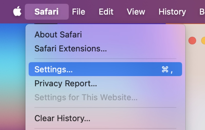
Step 2. Click on ‘Safari’ in the menu bar and then click on ‘Settings.’

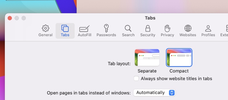
Step 3. Click on the ‘Tabs’ section at the top.
Step 4. Select ‘Compact’ and close the Settings window.

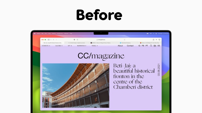
In essence you went from this:

To this:

You’ll instantly notice the tab bar merge into the URL one, leaving you with a clean look and feel. But that’s not all, you’ll also notice how Safari changes color when you visit certain websites. That tinting alone gives everything a massive aesthetic boost, which may actually inspire you in some creative workflows.
While this definitely looks great, some might find this UI to be a nightmare to navigate and use, especially if you believing in navigating around the toolbar area as quickly as possible.
You definitely lose the usefulness of the ‘Separate’ view. The Compact view is very, very tough to navigate especially if you have a ton of tabs open. The only thing it’s good for is making your Mac desktop look great. Nothing else.
There’s definitely good reason why Apple offers the Compact view an option rather than forcing it on to people. Because it’s not quite useable if you’re doing actual work. I’ve given the Compact view several shots thinking it might just work for me, but eventually I end up switching to Separate as it suits me better.


