In iOS 18 and iPadOS 18, you can disable app icon labels on the Home Screen of your iPhone and iPad, here’s how you do it.
Disable App Icon Labels and Achieve that Clean and Minimal Aesthetic Look on Your iPhone and iPad Home Screen
iOS 18 and iPadOS 18 brings a lot of great customization options to the table, including the ability to place an app icon anywhere you like on the Home Screen grid. Yes, anywhere at all. Try it right now.
However, some changes are better than others, such as the ability to disable app icon labels on the Home Screen. If you ever wanted app icons without labels underneath them to achieve that clean and minimalist look, you can do that now.
While the feature is there, it does come with one compromise that I’ll talk about later. But first, let me show you what you have to do:
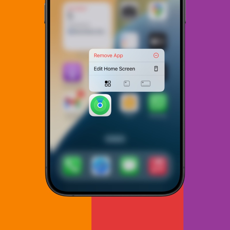
Step 1. Tap and hold on any app icon and then tap on ‘Edit Home Screen.’ Tapping and holding on an empty space on the Home Screen works, too.

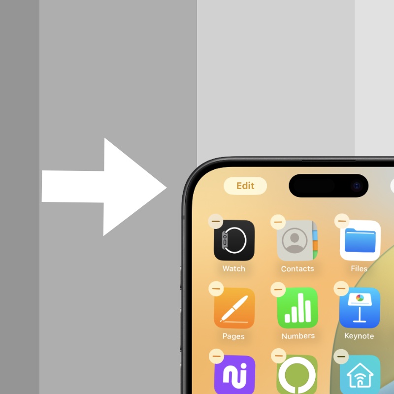
Step 2. Now tap on ‘Edit’ at the top left of the screen.

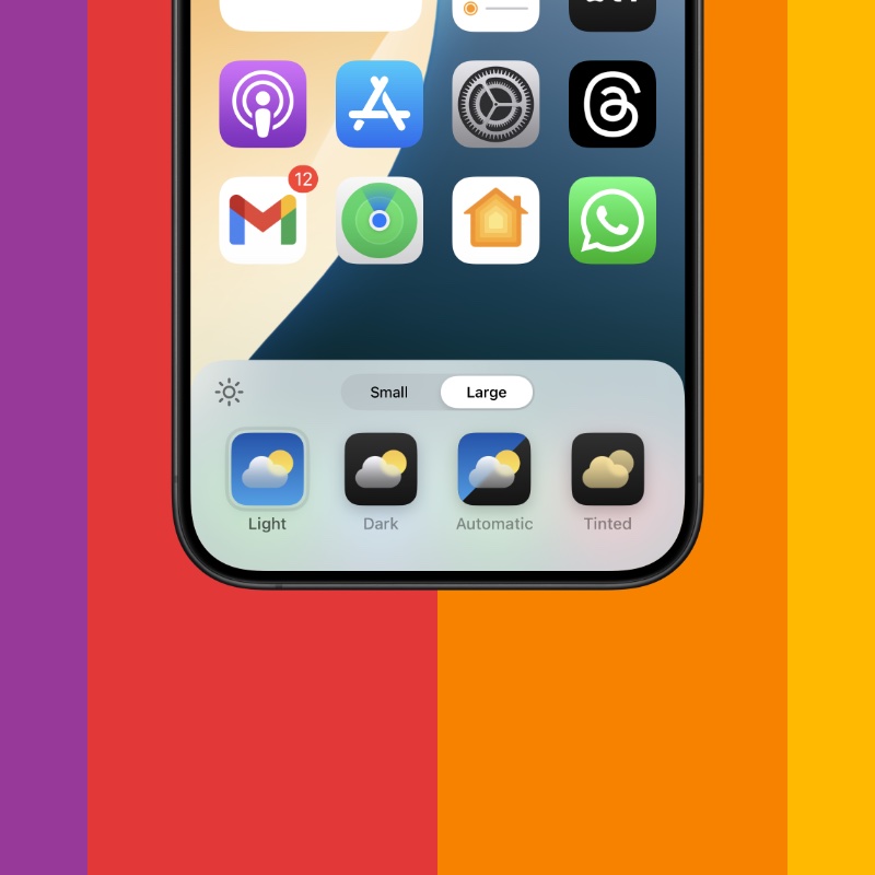
Step 3. Tap on ‘Customize.’
Step 4. You’ll see a bunch of options here, just tap on ‘Large.’ The app icon labels are now disabled and everything now looks clean and simple.

Your app icons are now without labels. You can further customize them by changing their tint, choose a dark background and so on.
However, the compromise here is an obvious one – you can’t disable labels without increasing the size of the app icons. I wish Apple changes this down the line and allows users to disable labels without having to increase the app icon size.
Though the large icons look fine on a 6.1-inch iPhone, but everything looks strange on a larger display, especially iPad. But hey, at least the option to remove the labels is finally here, so less complaining and more appreciating.
It’s truly amazing how far iOS and iPadOS has come in terms of customization options. It only feels like yesterday when you couldn’t even choose the wallpaper on your iPhone’s Home Screen and now Apple is allowing us to place app icons anywhere, change the color of icons, remove labels – we’re living in crazy times.
Though this seems like everything we ever needed in terms of customization, I’m pretty sure Apple is not done going a mile further. For example, the macOS Lock Screen could really use some iOS-ification by allowing users to change the clock style and font, at least.


