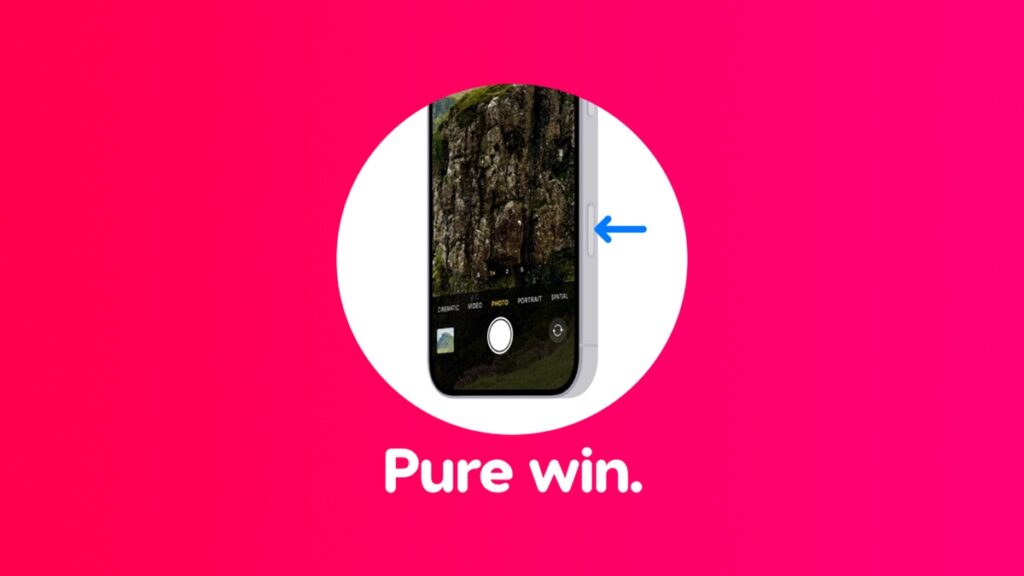
Apple is not the first one to add a shutter button to a phone, but Camera Control does it better than anyone else.
Adding a New Button is Easy, but Making it Meaningful is What Makes Camera Control in iPhone 16 Truly Stand Out
Believe it or not, the physical shutter button has been on iPhone for a long time. Don’t believe me? Launch the Camera app right now and press the volume up button.
You can even map the Action Button to do the same thing.
However, with Camera Control, Apple gives more meaning to the physical shutter button. See, the thing is, it doesn’t just take a photo. If you want to change a camera parameter, such as exposure, zoom, your fake bokeh, you can do it right from the button itself without touching the screen.
If you are already touching the screen to make changes, then you rather go for the software shutter button to take the photo for a consistent experience.
Camera Control absolutely wins when it comes to this. It lets you control the Camera app’s key parameters without touching the display and that’s a big deal.
Apple is giving people a simple choice with Camera Control – either do everything with Camera Control or use the display. You can opt for ‘something in between’ but that’s your choice.
I don’t like being in the hybrid area at all, a mix of a physical shutter button and on-screen controls, because monkeying around with my fingers is exactly what I don’t want to do.
I’m not a fan of shutter buttons at all. But it’s pretty amazing to see how Apple managed to transform it completely and made it far more useful, and the name makes perfect sense.
My point is, the shutter button problem was already solved with the first iPhone with an on-screen button. Apple didn’t solve the shutter button problem with Camera Control for the second time, it made sure it did something extra, and it definitely delivered.
That new button on your iPhone 16 is not just a button, it’s the entire Camera app right under your finger.


